


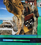


Travel leisure remix 2020 Challenge commentary - critique:
This magazine's flimsy paper is not ideal for collage. Despite the technical flaws, it had some unusual imagery. As a travel magazine, the landscapes and seascapes provided a fresh perspective. The series feels unified due to the green and blue colors; each set in some sort of natural environment. There is a deeper feeling to these collage due to the potential for story telling or displaying words to push that feeling further at the viewer. Composition wise there are two collages in this series that are epic fails. The collages are ranked most liked to least liked, from left to right.
First, the 'think' collage is a mess of ideas and lacks any coherent flow or design. In my view an epic fail. There are just too many elements foisted upon its viewer. Sometimes less is more; can't be overstated. To be flogged later.
The second fail is the Australian collage, a lame attempt at symbolism; the barbequed meat representing the wild fires that have recently rampaged this country. A weak composition with too many elements that really do not lead in any particular fashion. A twisted idea, not to mention in poor taste. It missed the mark. Double flogged for this mess!